Digital Ordering App Redesign
Background
Digital Ordering App is a white-label mobile app for NCR restaurant customers to serve online ordering and loyalty to their general guests. The redesign project aims to provide a refreshing user experience to the users with better UX architecture and more consistent UI.
Design Process
The design team of this project includes two UX/UI designers and a UX researcher. I worked closely with the team through out the whole design process, and was leading the tasks including stakeholder interview, wire-framing and UI prototyping.

PHASE 1
Defining Problems and Top Priorities
The redesign project was initiated by the product manager of Digital Ordering, and the initial expectations were set as the following:
Provide a better navigation across the app.
Cleaning the homepage.
Refresh the UI for better look and feel.
To validate the initial problem and requirement, our team started from three directions - to audit the current Digital Ordering App, to talk with stakeholders, and to review the competitive products in the market.
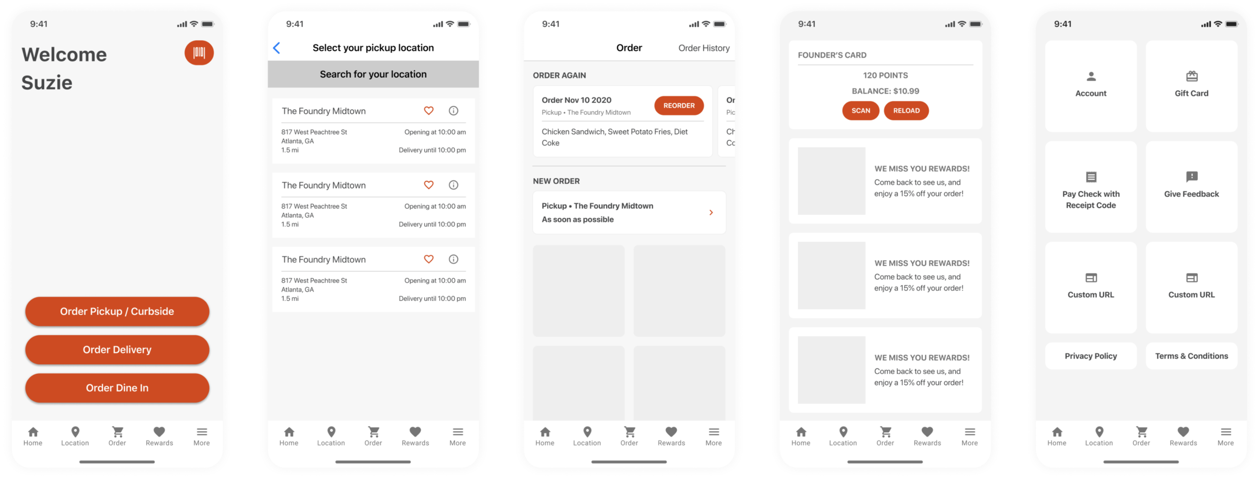
Current App Audit
I reviewed our current App, and discovered several failures, including:
UX
Main functionalities are listed as cards on Homepage, unclear information structure
Duplicated entry from homepage and hamburger menu
Extra steps for quick links (Quick Order, Order from favorite stores, etc.)
UI
Inconsistent UI components through out the App.
Inconsistent use of colors and white-label rules.
While auditing the App, our team also structured the information architecture. It was clear to see that the current App has duplicated entries in homepage as well as in the navigation menu, and all the features are presented in a parallel style without priority.
Stakeholder Interview
To fully understand the expectations and requirements, I conducted a series of stakeholder interview with product manager, lead developers, sales person and several restaurant customers (1 customer with over 100 stores, 2 customer with less than 10 stores) to understand their expectations about the App.
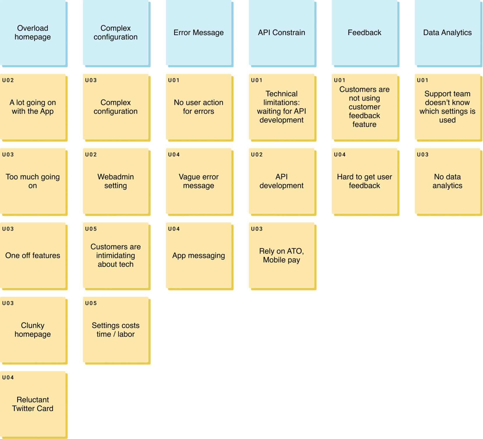
Stakeholder Interview Affinity Mapping
What do you dislike about the app?
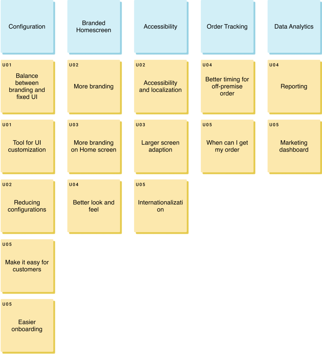
Stakeholder Interview Affinity Mapping
If you could make some changes, what would you change for the app?
From the stakeholder interview, we saw several common concerns and expectations:
Redesign the App structure, and especially the homepage for a clearer and more branded view.
Provide a better rule / guideline for App configuration and customization.
Better messaging.
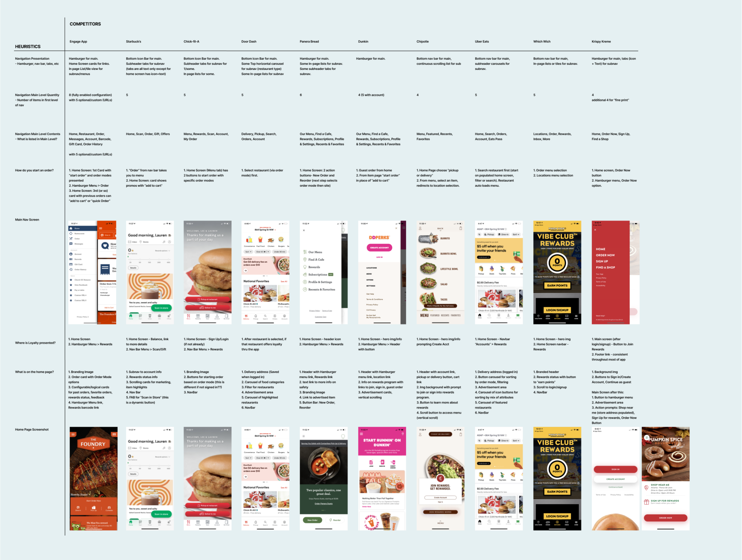
Competitive Analysis
As talking with our internal stakeholders and customers, one question I asked was about the benchmark online ordering mobile app in their mind. We also investigated in App stores and Google play stores to analyze and compare over 10 online ordering mobile apps.
From the discovery phase, we validated the initial request for the redesign project, and cleared our design goals as the following:
Clear the app structure and redesign navigation
Design the landing page of the main features
Audit the UI and define a consistent style-guide
UX Design & Iteration
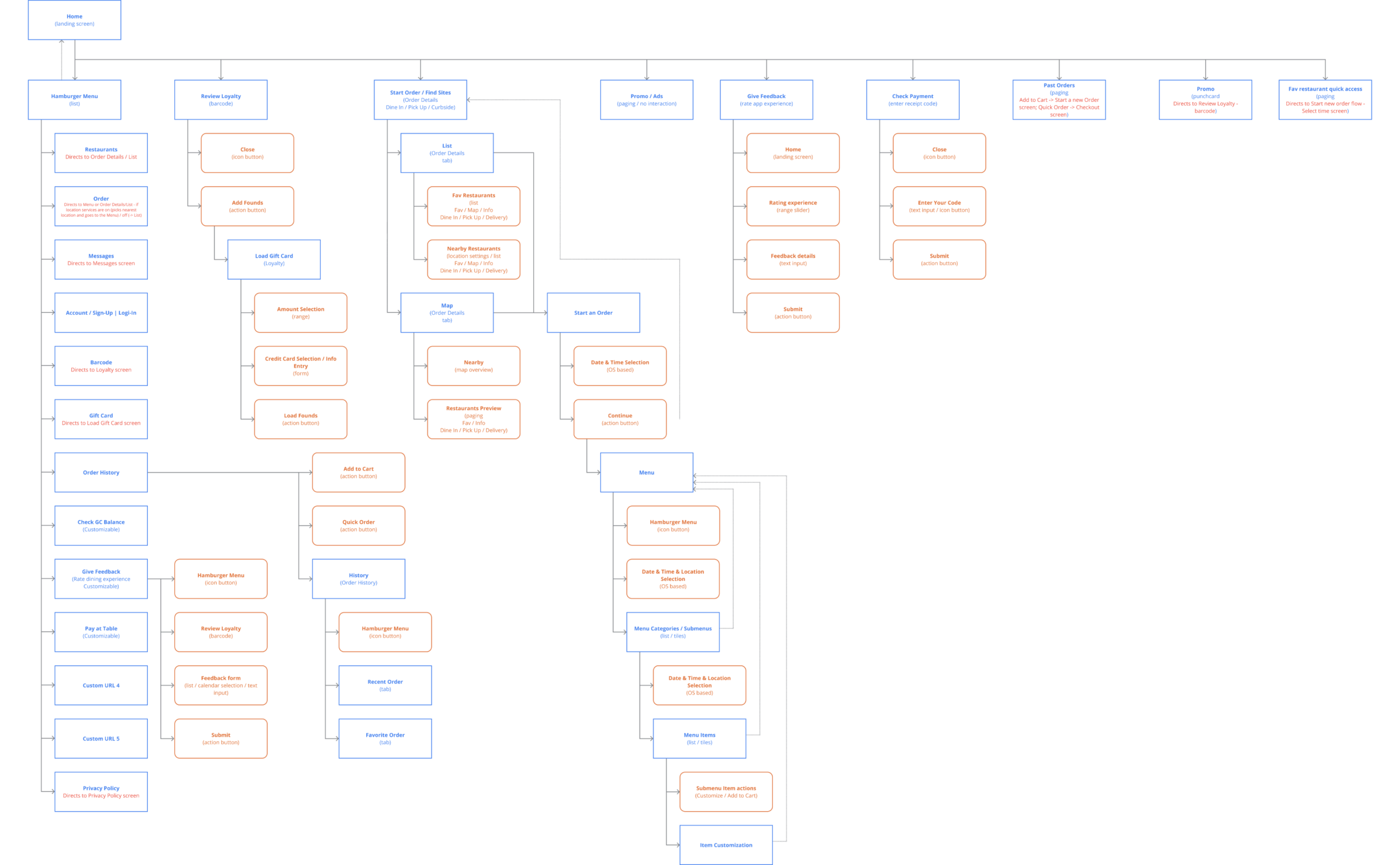
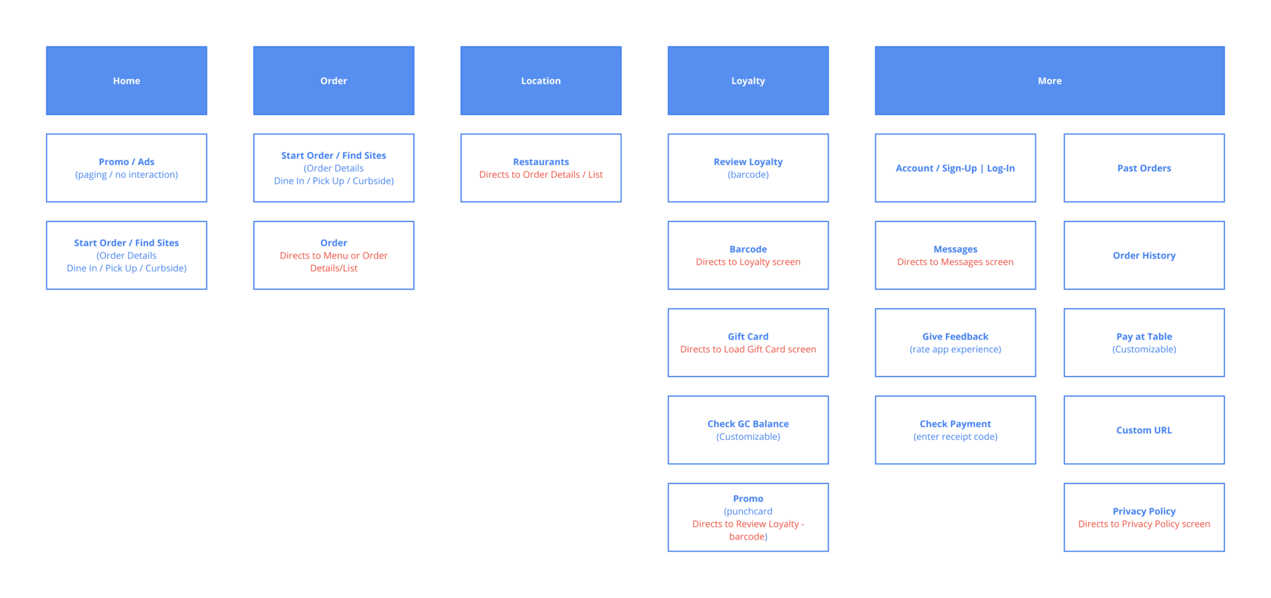
Rebuild the architecture
With the understanding of the current App, we tried different ways to group the key features of the App. We also conducted card sorting with over 50 subjects to understand the structure in our consumers’ perspective.
After several rounds of discussion and iteration, we finalized the groups - also worked as the navigation tabs as Home, Order, Locations, Loyalty and More.
UX Design & Iteration
Wireframing
We started the app wireframing with blocks of contents to get a sense of the essential sections and their complexity. Compared with the current App, the main functions are directly listed as navigation tabs for different use cases. We decrease the contents on the homepage so that the customers will have more flexibility for branding and advertising, “Start your order” is also emphasized.
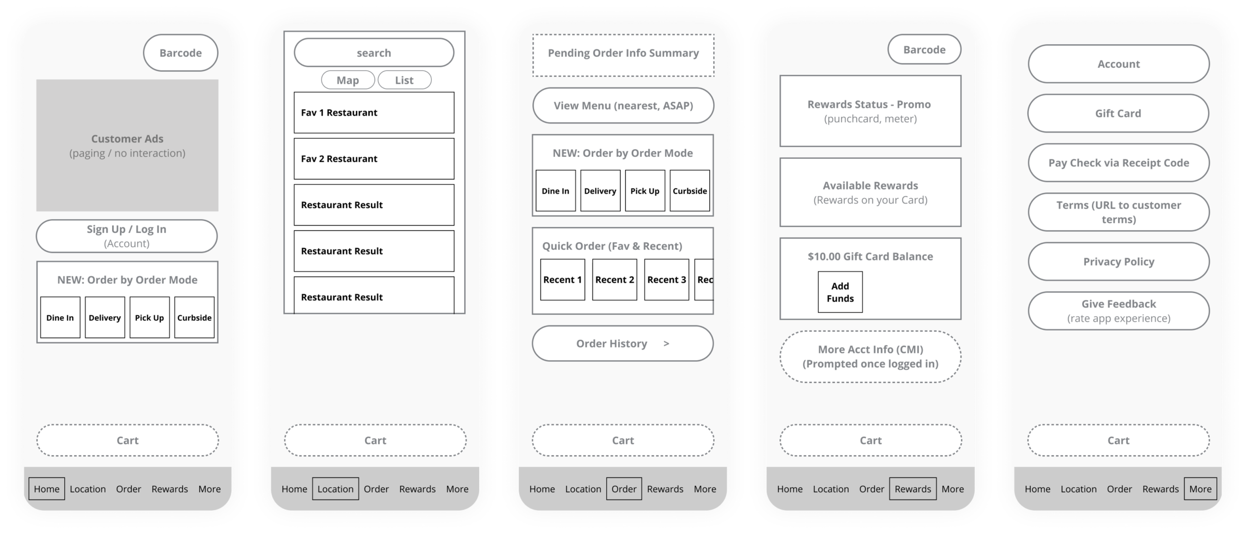
Walking through the draft wireframe, one of the biggest concerns was about the ordering page - we would like to provide more ordering entries to the consumers, while on the other hand, the entries may also cause hesitation and mis-operation.
What is the most common way for ordering? After several rounds of brainstorming and iteration, we finally refined the wireframe and simplified the ordering page with Reorder feature and the Menu.
Design Iteration
Homepage
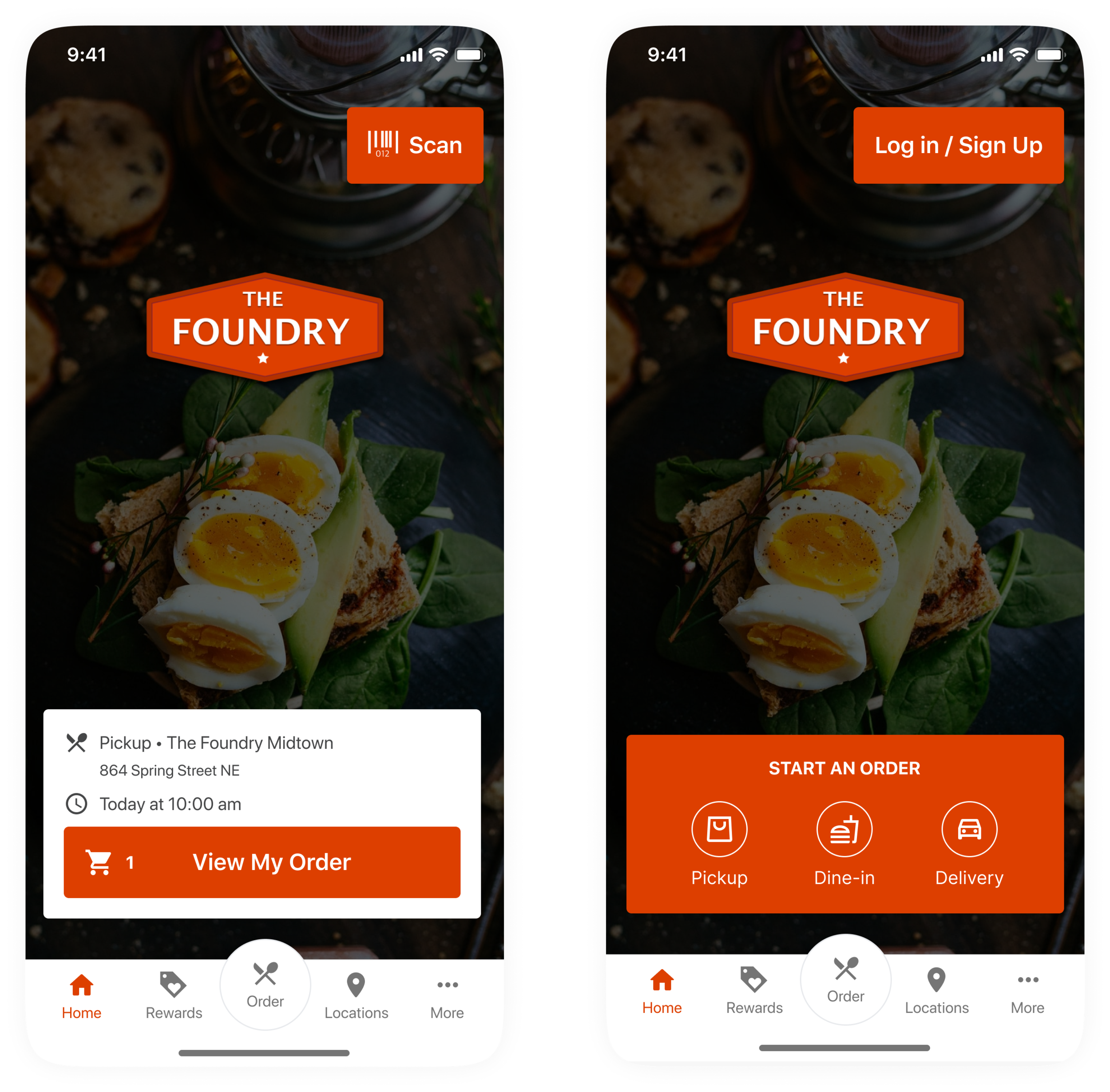
By eliminating the cards in Homepage, customers have more flexibility to customize the branding and provide promotions.
From our customer interviews, about 10% of order revenue comes from scanning in store. We retain the scan button and the start new order card to support the majority of use.
Locations Page
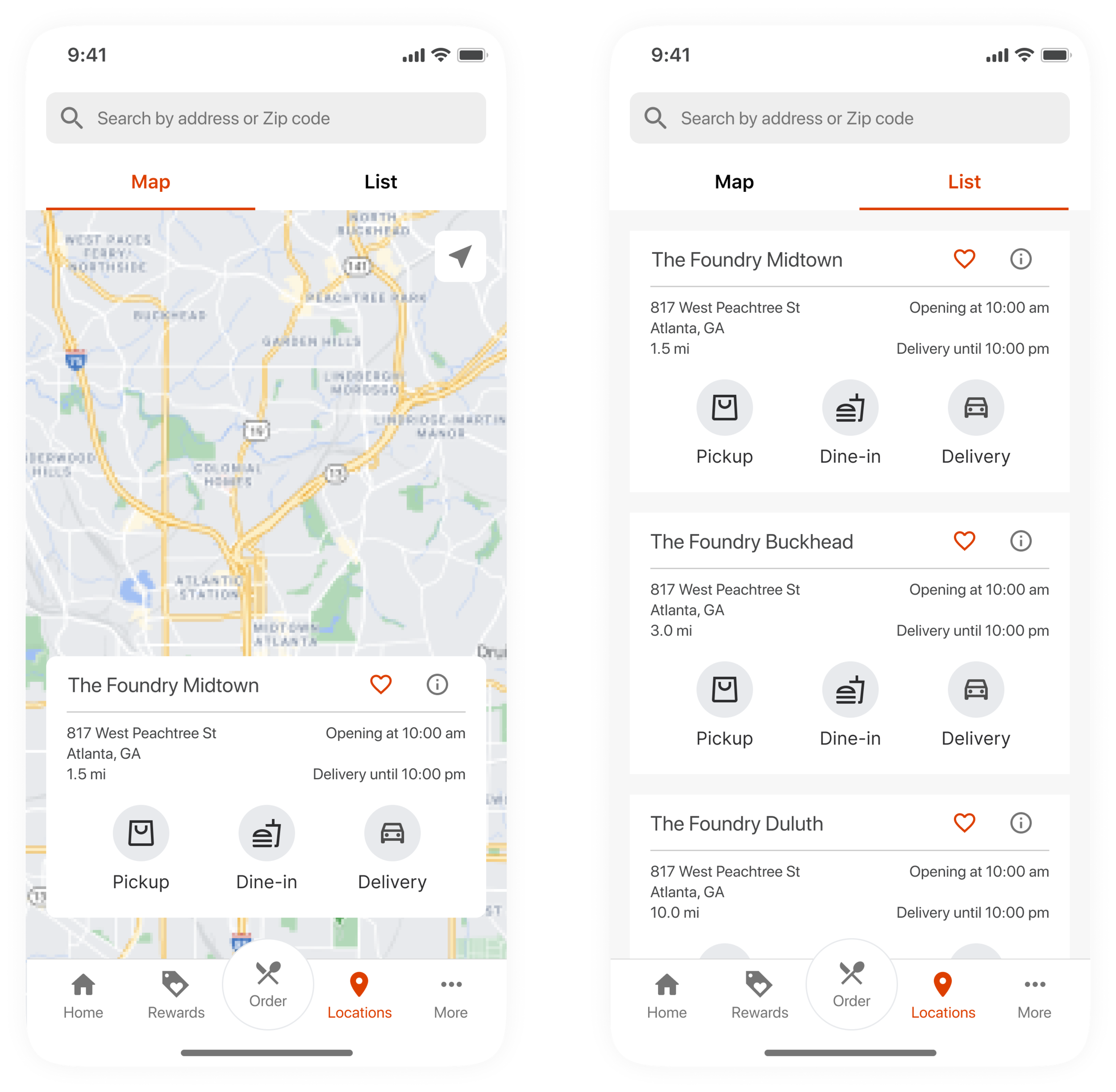
Locations page is important for customers with multiple stores in one area. It also provides another entry for users to start their order.
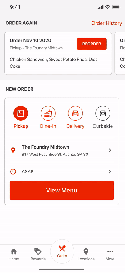
Ordering Page
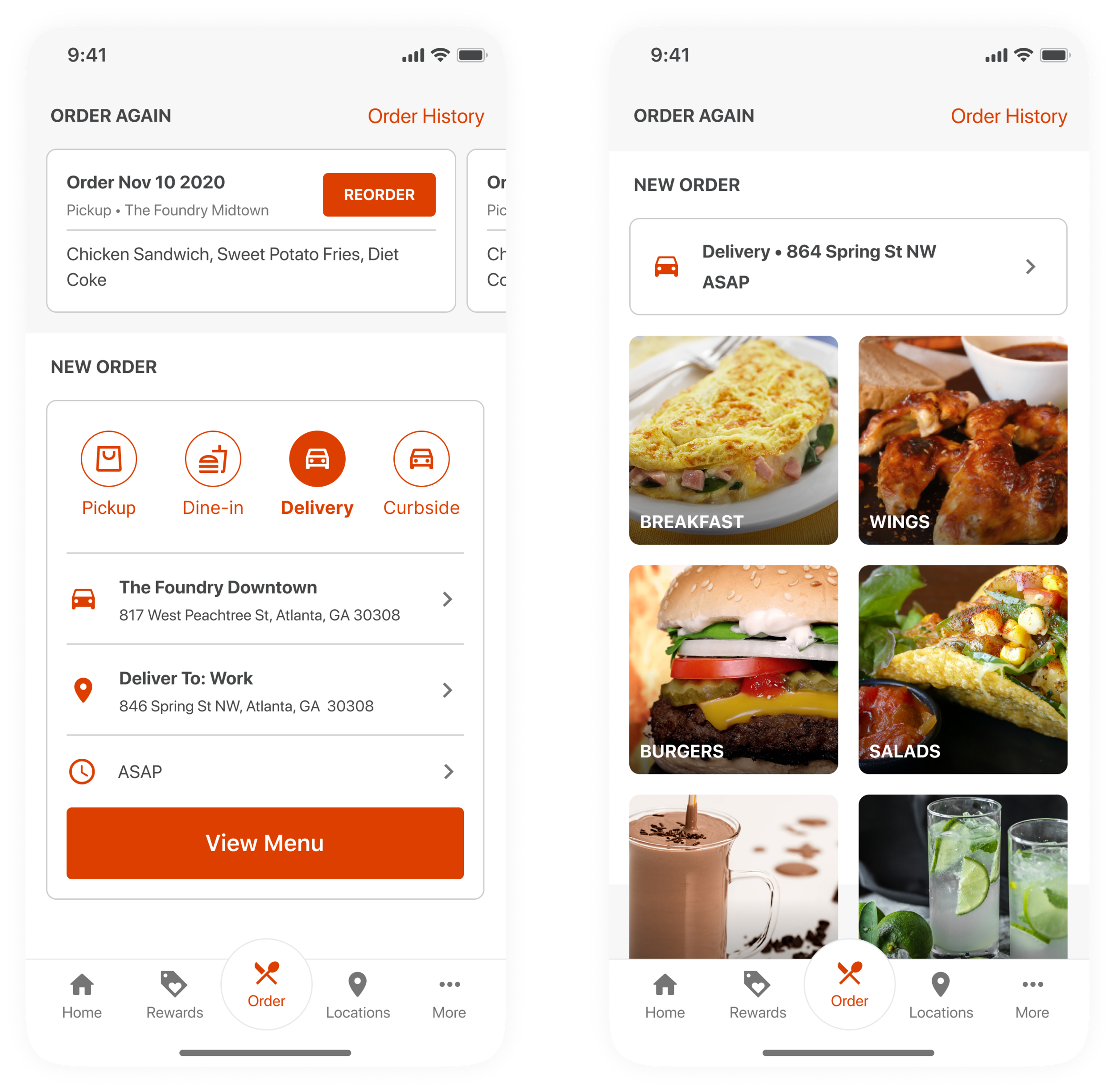
Ordering page is the most important and profitable feature for Digital Ordering App, and we hope to provide a quick and easy experience for users to start their order. Instead of guiding the users to select order method, location and time, we provide a default value based on most common selection and user’s nearest location.
To avoid orders from incorrect locations, an extra confirmation step is required before seeing the menu.
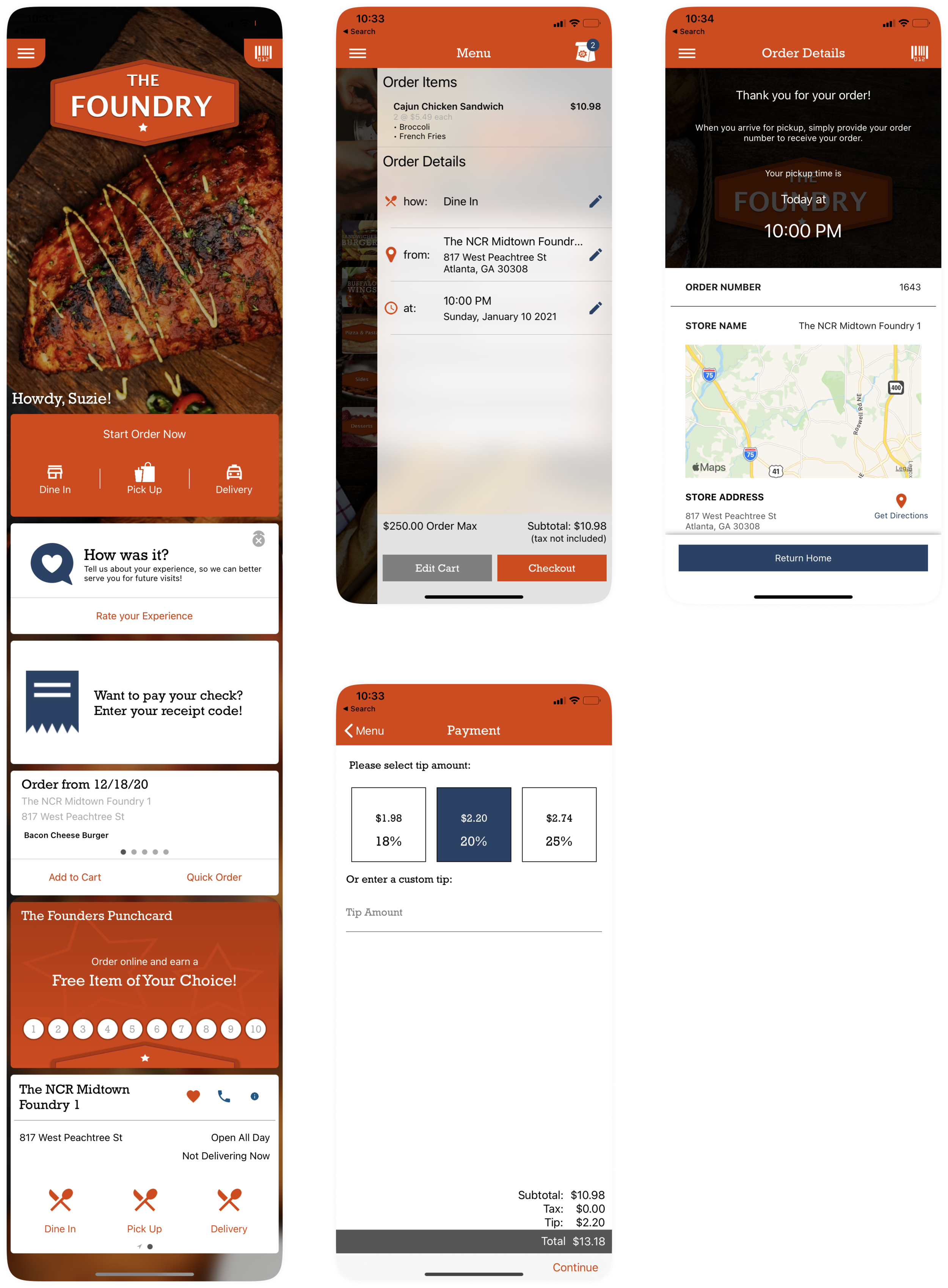
Interaction Demo: Ordering flow